
Pink gets misunderstood. People think it’s childish. People think it’s only for nurseries. People think it can’t look modern, elegant, or grown-up, but that’s wrong. Pink is one of the most transformative colors in interior design. And if you’ve never explored different pink wallpapers, you’re missing out on one of the easiest ways to warm up a space without overwhelming it.
Pink gives you control. Pink sets a mood quickly. Pink adds personality without crossing into chaos. Pink can be soft, bold, sweet, minimal, or dramatic. It just depends on the shade. It depends on the texture. It depends on the pattern.
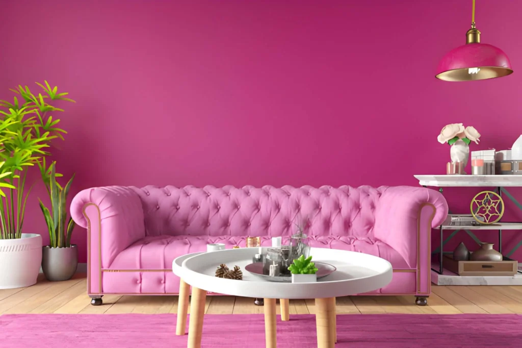
Designers use pink more often than you think because pink makes rooms feel alive. It adds warmth where whites fall flat. It adds charm where neutrals fail. It creates an atmosphere that feels intentional, not accidental.
Let’s break down why pink works almost everywhere, even in rooms people assume should be “neutral” or “safe.”
Pink Creates Warmth That Feels Natural
Pink sits between red and white. You get the warmth of red without the aggression. You get the softness of white without the coldness. That balance makes pink extremely usable.
When you walk into a room with pink undertones, you feel a shift. The space feels warmer instantly. Warmer in tone. Warmer emotionally. Warmer in the presence.
Pink creates a welcoming atmosphere.
Pink makes rooms feel open and alive.
That’s why restaurants use warm pink tones in dining areas. It relaxes people. It softens conversations. It creates a sense of ease without ever feeling sleepy.
Pink warms up everything around it—whether it’s gold, brass, white oak, walnut, rattan, or stone. Even a small amount changes the emotional temperature of the space.
Pink Comes in More Shades Than You Think
People underestimate the range. They think pink is just bubblegum or baby pastel, but the spectrum is massive.
Blush
Blush pink feels neutral. Soft. Elegant. Calm. Designers use blush as a base color because it pairs well with everything.
Dusty Rose
Dusty rose feels romantic. Vintage. Lived-in. It adds depth without overwhelming the room.
Coral
Coral feels energetic. Sunny. Fresh. It brightens dark spaces quickly.
Mauve
Mauve feels modern. Moody. Sophisticated. It works well in bedrooms and offices.
Hot Pink
Hot pink feels bold. Electric. Confident. It’s perfect for accent walls and statement patterns.
Every shade creates a different mood. That’s why pink wallpaper works in spaces that need personality. It’s versatile. It’s flexible. It adapts.
Pink Makes Furniture Stand Out
Pink isn’t loud when used correctly. It’s supportive. It frames other elements. It makes objects pop without stealing attention.
Light woods look richer against pink.
Metal looks brighter.
Textiles feel softer.
Artwork looks curated.
Plants look greener.
Pink acts like a highlighter. It elevates everything it touches.
A pink backdrop makes details more intentional. That’s why many showrooms and boutiques use it. Products look better. Spaces feel more designed. The eye stays engaged without getting overwhelmed.
This effect doubles when you use a patterned wallpaper instead of paint. Texture changes everything.
Patterns Push Pink Even Further
Patterns unlock the full potential of pink. Instead of a flat wall, you get movement. You get dimension. You get personality.
Floral Patterns
Soft florals feel romantic. Classic. Feminine without being childish.
Geometric Patterns
Geometric shapes feel modern. Clean. Structured. They balance the softness of pink perfectly.
Abstract Prints
Abstract prints feel artistic. Fresh. Unexpected. They fit creative spaces well.
Textured Designs
Textured pink wallpaper adds depth. It creates shadows. It mimics fabric or plaster.
Patterns give you control over the vibe. You can go bold. You can go subtle. You can go ultra-modern or vintage or minimalist.
You can express more with a pattern than plain paint ever could.
Pink Works in Every Room
This is where pink proves its versatility. It doesn’t belong to one space. It fits everywhere.
Living Rooms
Pink makes living rooms feel cozy. Warm. Inviting. It softens large furniture and makes the room feel balanced.
Bedrooms
Pink creates calmness. It makes bedrooms feel personal and intimate without being heavy.
Bathrooms
Pink adds charm to bathrooms. It pairs well with marble, tile, and black accents.
Offices
Pink boosts creativity. It lightens the energy. It relieves visual tension.
Kitchens
Pink kitchens are trending. They feel stylish. Unexpected. Happy.
Dining Rooms
Pink softens dining spaces. It keeps the mood relaxed and social.
And yes—pink even works in minimalist spaces. In fact, minimalists use pink strategically because it brings life without clutter.
Pink Isn’t Just Feminine
This is one of the biggest misconceptions. Pink is not a “girly” color. Pink is a design tool. It’s all about context.
Pair pink with black?
You get a modern, edgy look.
Pair pink with navy?
You get a sophisticated palette.
Pair pink with olive green?
You get a rich, earthy combo.
Pair pink with metallics?
You get luxury.
Pink is powerful because it blends. It adapts. It transforms based on what surrounds it. Designers use pink in masculine spaces all the time—just in deeper, toned-down shades like mauve or terra cotta.
Pink is about balance, not stereotypes.
Pink Makes Spaces Feel Fresh
Pink is visually uplifting. It wakes up a dull room. It adds energy without shouting.
When a room feels flat, pink fixes it. When a room feels cold, pink warms it. When a room feels empty, pink fills the emotional gaps.
It’s one of the easiest ways to refresh a space without making major changes. You can keep the same furniture. You can keep the same decor. Add pink wallpaper, and the room feels renewed instantly.
Pink Handles Both Modern and Vintage Styles
Pink moves between eras smoothly.
For Modern Design
Use blush pink with geometric patterns. Pair it with matte black or brass. Add clean lines.
For Vintage Style
Use dusty rose or floral patterns. Add warm woods. Mix antique frames and soft fabrics.
For Mid-Century Modern
Use coral or bold shapes. Pair with walnut, tapered legs, and warm metals.
For French Country
Use soft blush or textured pink wallpaper. Add ornate details and linen fabrics.
Pink doesn’t lock you into one aesthetic. It flows wherever you need it.
Pink Makes Small Spaces Feel Charming
People think dark colors shrink rooms and light colors expand them. That rule misses one thing: warmth matters more than brightness.
Pink makes small rooms feel intimate. Cozy. Thoughtful.
Powder rooms become conversation pieces.
Nooks feel intentional.
Closets feel custom.
Pink wallpaper adds personality in tight spaces where neutral paint gets lost.
Pink Creates Emotional Balance
Colors influence how we feel. Pink calms the mind. Pink lowers visual stress. Pink creates softness where life feels sharp.
A pink room feels safer.
A pink room feels more comfortable.
A pink room feels welcoming.
That emotional effect matters. Especially in bedrooms, offices, and living areas.
The Bottom Line
Pink isn’t a trend. It’s not a gimmick. It’s not limited to one style or one age group. Pink is a design solution. A flexible tool. A warm touch that makes any room feel more complete.
It works in modern rooms. Vintage rooms. Small rooms. Large rooms. Cozy rooms. Minimal rooms. Pink adapts and supports everything around it.
If you want a room that feels alive, warm, balanced, soft, or elevated, look at pink wallpapers and choose a shade that fits your mood.
Let the color do the rest.
Also Read-Sparkling Spaces Start At Home